Unique Photo Images
Monday, April 30, 2007
Early Morning
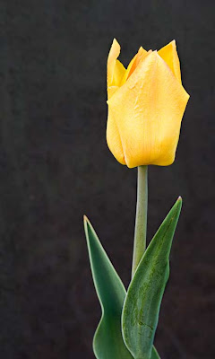
With the cool 50 degrees and the damp due covering the grass and flowers, the Lone Tulip is closed in a tight bud. Another last look at this beauty before it's time is up.

With the cool 50 degrees and the damp due covering the grass and flowers, the Lone Tulip is closed in a tight bud. Another last look at this beauty before it's time is up.
Sunday, April 29, 2007
Only one Tulip
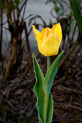
We have only one Tulip in our yard. I have tried to record this beautiful single Tulip and the only one that we will have for this season. The squirells ate the other bulbs. I am still on the learning project of close-up nature. This image was photographed using a 100 mm Macro lens on a tripod with a wind shield, a difuser disk and materials to diminish background highlights.

We have only one Tulip in our yard. I have tried to record this beautiful single Tulip and the only one that we will have for this season. The squirells ate the other bulbs. I am still on the learning project of close-up nature. This image was photographed using a 100 mm Macro lens on a tripod with a wind shield, a difuser disk and materials to diminish background highlights.
Friday, April 27, 2007
Start of a Fiddlehead Fern

The first sprouts of Ferns in a shaded part of our yard. These baby Fiddlehead Ferns will be photographed more at a later time.

The first sprouts of Ferns in a shaded part of our yard. These baby Fiddlehead Ferns will be photographed more at a later time.
Thursday, April 26, 2007
More out of the Box Images
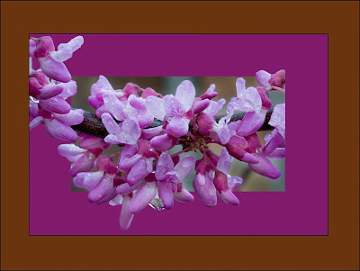
Using a free action, this procedure becomes a tool to expand artistic areas of flowers.

Using a free action, this procedure becomes a tool to expand artistic areas of flowers.
Wednesday, April 25, 2007
Another Spring beauty
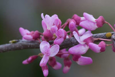
A "red Bud" tree brings a little spring beauty to our yard. This tree is very popular and grows in the wild in Southern Illinois. In fact there is town south of the St. Louis metro area called Redbud, Illinois after the tree. It is fun learning how to do close-up nature photography.

A "red Bud" tree brings a little spring beauty to our yard. This tree is very popular and grows in the wild in Southern Illinois. In fact there is town south of the St. Louis metro area called Redbud, Illinois after the tree. It is fun learning how to do close-up nature photography.
Tuesday, April 24, 2007
Community Band in Des Plaines
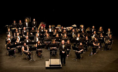
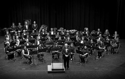
This image was taken in color from the balcony with available stage lighting. Image was imported into Photoshop Lightroom and then further worked on in Photoshop CS2.


This image was taken in color from the balcony with available stage lighting. Image was imported into Photoshop Lightroom and then further worked on in Photoshop CS2.
Monday, April 23, 2007
The Old Sea Captin
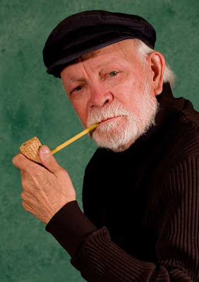
Howard Sheffield served as a model for the Des Plaines Camera Club "Digital Camera Party" at the Des Plaines Library.

Howard Sheffield served as a model for the Des Plaines Camera Club "Digital Camera Party" at the Des Plaines Library.
Sunday, April 22, 2007
Digital Camera Party
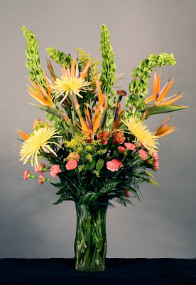
The Des Plaines Camera Club served the Community Saturday, April 21.2007 by setting up a studio and showing others how to better take photographs with their digital cameras at a fund raiser for the Des Plaines Public Library. Visitors to the Library had a chance to photograph the above floral arrangement by CR Flowers or photograph a model. Fun was had by all.

The Des Plaines Camera Club served the Community Saturday, April 21.2007 by setting up a studio and showing others how to better take photographs with their digital cameras at a fund raiser for the Des Plaines Public Library. Visitors to the Library had a chance to photograph the above floral arrangement by CR Flowers or photograph a model. Fun was had by all.
Friday, April 20, 2007
Computer Art?

Have you ever looked behind you computer at all the wires and connections. Look at the interesting free form patterns.

Have you ever looked behind you computer at all the wires and connections. Look at the interesting free form patterns.
Monday, April 16, 2007
Sunday, April 15, 2007
Name that Flower?
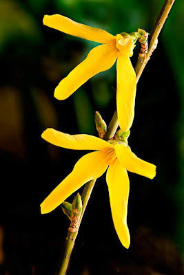
Learning about close-up nature shooting from Barbara Kudrnovsky and Ruth Smith has opened a new and exciting vista of backyard photography. See if you know the name of the above flowers?
20 Points of Classical Composition.
These principles are for guidance to help you to make better, more pleasing pictures. When working with them, BE THEIR MASTER, NOT THEIR SLAVE! Good pictures are never made on principles alone.
1. Move in Close. – Have main subject fill the frame unless surrounding is part of the story. Move in or use a telephoto lens. Don’t include anything having nothing to do with the subject
2. .Use the thirds method. – Avoid cutting scene in half with strong lines. If sky isn’t beautiful leave it cut as much as possible. Mountains look higher if you can cut them off at the skyline.
3. Placement of the center of interest. – Never in the middle! However, not all pictures have a center of interest or should have one.
4. Choice of vertical or horizontal. – If scene has mostly horizontal format lines, use horizontal format. If vertical lines, vertical will be more pleasing. Horizontal expresses peace and tranquility, vertical is strong and bold.
5. Avoid a group monotony. Don’t line up in a row; have them do something.
6. Balance your picture. Dark objects are “heavier” visually. If all dark is on top or one side of p8icture it is unbalanced and makes us uncomfortable. Avoid imbalance with larger and smaller objects.
7. Include foreground objects. Very important in scenic photography. Balance distant scene with something or someone in foreground. Fro critical depth of field it is important to use tripod. Foreground can include framing.
8. Use of framing. Simplest trick in good photography. Use it to cover empty sky or uninteresting foreground. When using tree branches try to include some trunk. Framing must be sharp as will as rest of picture. Note (It is possible to use foreground very out of focus for framing; e.g. colored leaves. This is not easy to do, but is very effective when handled properly. Must be done with telephoto lens; shallow depth of field.
9. Leading lines. People enjoy a picture more when lines lead into picture the way we read. Opposite way is not wrong and can be pleasing, but usually it’s best L to R. Never begin a line in a corner – go either above or below the corner with a leading line.
10. Use a stopper. A line leading in can also lead the eye out of the picture. Something is needed to stop the eye and keep it on the picture e.g., a tree or open gate.
11. Avoid mergers. Check& double check for merger of lines or subject with background. Easy to overlook. Mergers distract depth and perspective, merging subject and background in one plain. Use care that background makes subject standout.
12. Placement of a moving subject. Subject in motion should be coming into picture—not leaving. Best L to R but opposite is not wrong. Exception could be if you are trying to express something by other placement.
13. Face toward the center. Same principle as #12. Subject should not be looking out of picture. Have more space in direction person is looking. This applies to flowers as well as living creatures.
14. Eliminate distractions. Pick it us and move it. Hide it behind a tree or fence. If neither works use a longer lens to focus only on subject & throw distractions out of focus. Check for bits of rubbish which can ruin a good picture.
15. Placement of a person in scenery. For vacation photography, if person occupies more than 1/4 of the frame it is no longer a scenic picture. Have person look into scene, not at camera.
16. Simplicity and unity. Don’t make picture too busy. Avoid too many objects or subjects. In general, simple pictures are best.
17. Consistency. To show height have subject in upper part of picture. To show depth have subject in lower part of picture.
18. Trick of imagination. To show something not in the picture, e.g. people walking out of church – only 5 were there, show 5 in scene with one walking out of picture gives impression many people were there. Leave something to imagine.
19. Odd and even numbers. Odd #’s are generally more appealing than even #’s. If you can’t avoid even #’s, don’t line them up in a row, or space them evenly.
20. Check color proportion. Try not to have two predominant colors 50/50 in the picture. 20/80 proportion would be better.
In General: When you show your pictures, you are saying: “Look at this;” or “Listen to me.” Perhaps the above principles would not fit with what you are trying to say. Do your own thing. Express yourself.
This collection of composition ideas were organized by the late John Kohout
Friday, April 13, 2007
Thursday, April 12, 2007
Study of Building Details
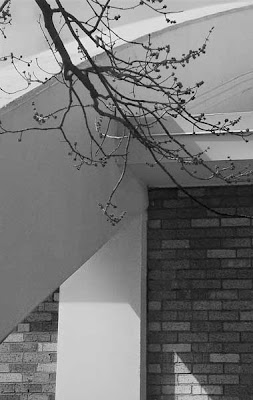
Maine West High School in Des Plaines has some very non-traditional features such as this roof to the swimming pool.

Maine West High School in Des Plaines has some very non-traditional features such as this roof to the swimming pool.
Wednesday, April 11, 2007
Springtime in Chicago!
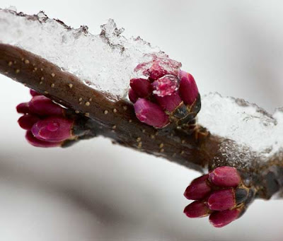
This Red Bud tree with snow and ice shows the signs of Chicago weather on April 11, 2007. Even the Cubs game was cancelled today.

This Red Bud tree with snow and ice shows the signs of Chicago weather on April 11, 2007. Even the Cubs game was cancelled today.
Tuesday, April 10, 2007
Art in Public Places is Fun to Photograph
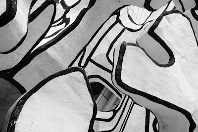
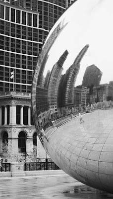
Located outside the State of Illinois Building in Downtown Chicago, this public sculpture can provide endless entertainment for photographers and the viewing public.

Located outside the State of Illinois Building in Downtown Chicago, this public sculpture can provide endless entertainment for photographers and the viewing public.
Monday, April 09, 2007
All Art Starts Somewhere

This is the beginning of a clay structure being created by a high school student in the Maine West High School Art Department in Des Plaines, Illinois. Created by hand and through the imagination of the student, this pot or bowl is just in the beginning stages.

This is the beginning of a clay structure being created by a high school student in the Maine West High School Art Department in Des Plaines, Illinois. Created by hand and through the imagination of the student, this pot or bowl is just in the beginning stages.
Sunday, April 08, 2007
Look Up!
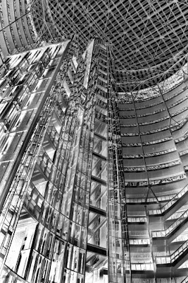
Here I used infrared and then inverted the file to give a negative effect to the interior to the State of Illinois Building in Chicago.

Here I used infrared and then inverted the file to give a negative effect to the interior to the State of Illinois Building in Chicago.
Saturday, April 07, 2007
Home Deliveries? Not any more!
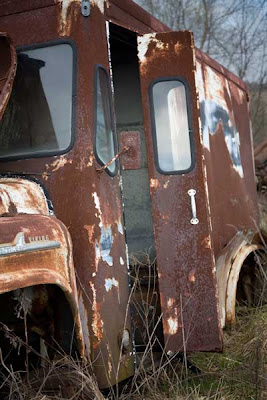
This old milk truck has see it's last useful days as a delivery truck, but I find that there are a lot of photo possibilities and hope to return and do more work when in the St Louis area.

This old milk truck has see it's last useful days as a delivery truck, but I find that there are a lot of photo possibilities and hope to return and do more work when in the St Louis area.
Thursday, April 05, 2007
Chicago from the late 1800s

Originally the Chicago Public Library, this building for many years has been the Chicago Cultural Center. The marble floors and wall are stunning, and this large Tiffiny Glass Done is truly breath taking. The glass dome is one of the largest glass structures that Tiffany ever completed.

Originally the Chicago Public Library, this building for many years has been the Chicago Cultural Center. The marble floors and wall are stunning, and this large Tiffiny Glass Done is truly breath taking. The glass dome is one of the largest glass structures that Tiffany ever completed.
Wednesday, April 04, 2007


